AQUA FLOR
Brief: To create the packaging of the ambient perfume.
Concept: The ambient perfume takes you on a journey through the Italian
the Italian citrus groves, bringing natural and rare materials in your
living rooms.
the Italian citrus groves, bringing natural and rare materials in your
living rooms.
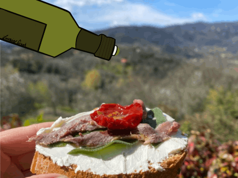
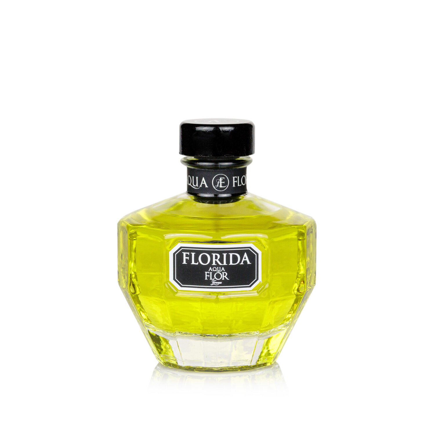
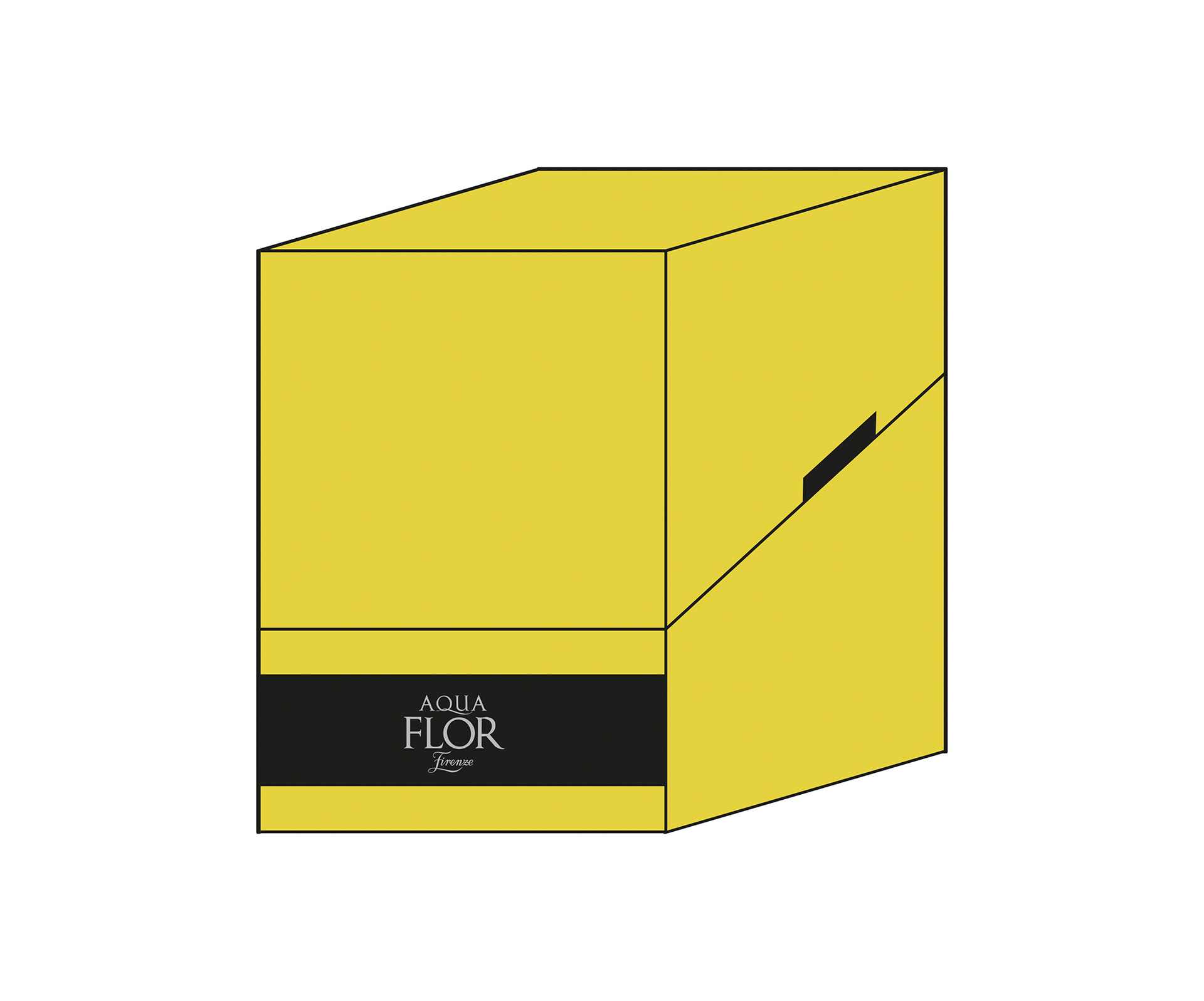
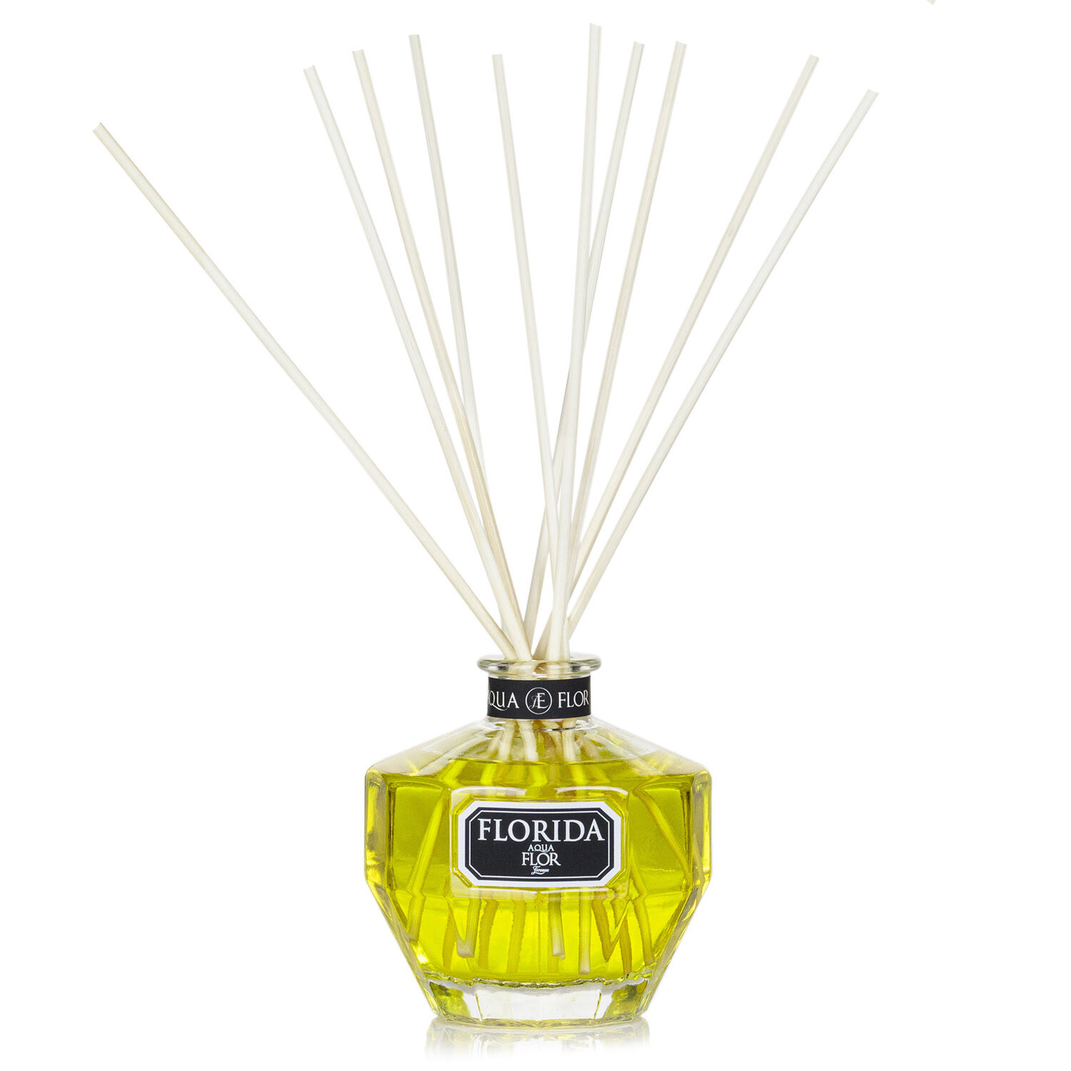
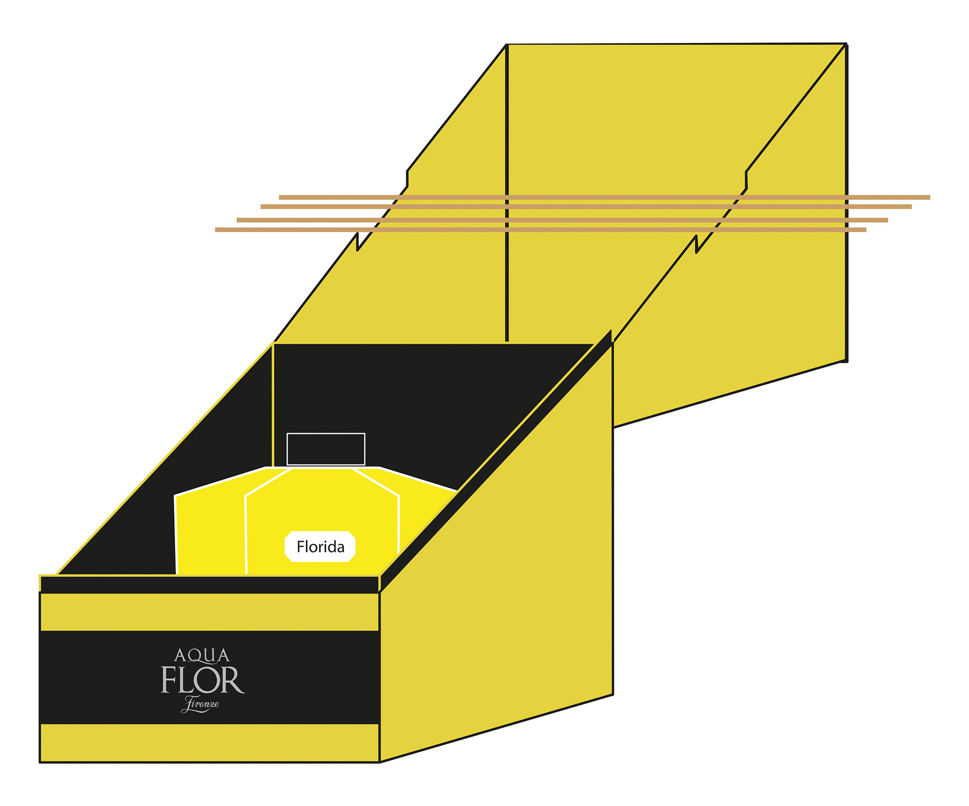
Creative Idea: The packaging, created specifically for the fragrance "Florída", designed to be reusable.
The box, which opens like a treasure chest, has been designed both to contain the fragrance and to let the sticks dry, in order to make the packaging not only a decorative element but also a practical and functional object.
The opening of the box also wants to denote the preciousness and refinement of the fragrance, which, with its particular diamond shape, becomes an object of luxury, as if it were a real jewel kept inside.
Team: Virginia Bellucci, Elisa Renzetti
DINI CAFFÈ
Brief: Rebrending and Advertising Campaign.
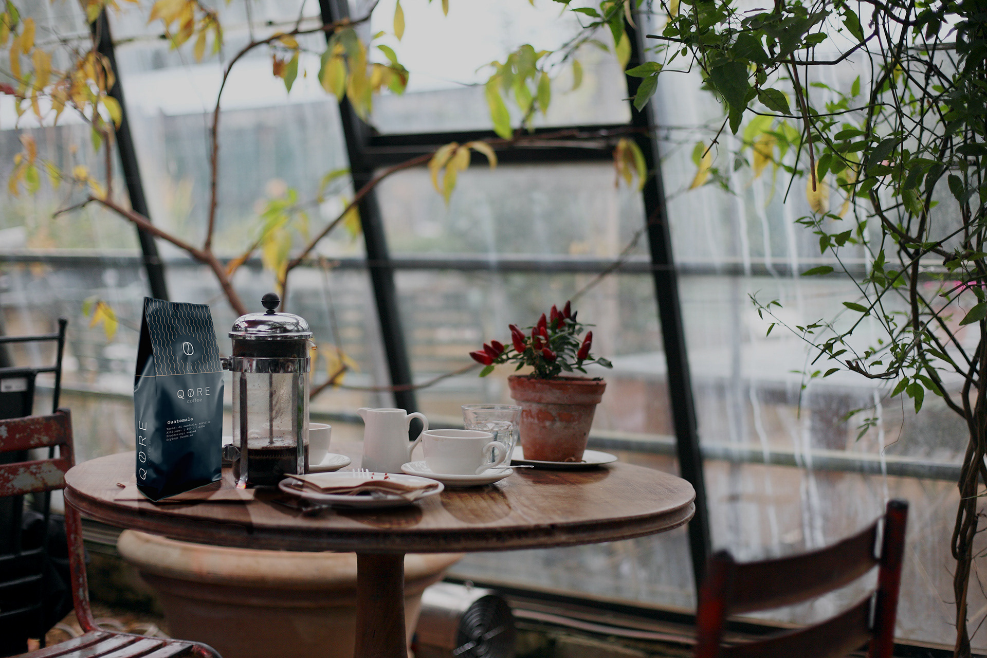
Concept: Coffee can be an experience that takes people on a journey made of tradition and sensations.
Insight: "Changing my habits - of coffee culture - I would like to discover a world that I did not know, with all its differentiation and tradition. There is an exclusivity of experiences that I was not aware of, so coffee
is not just coffee."
is not just coffee."
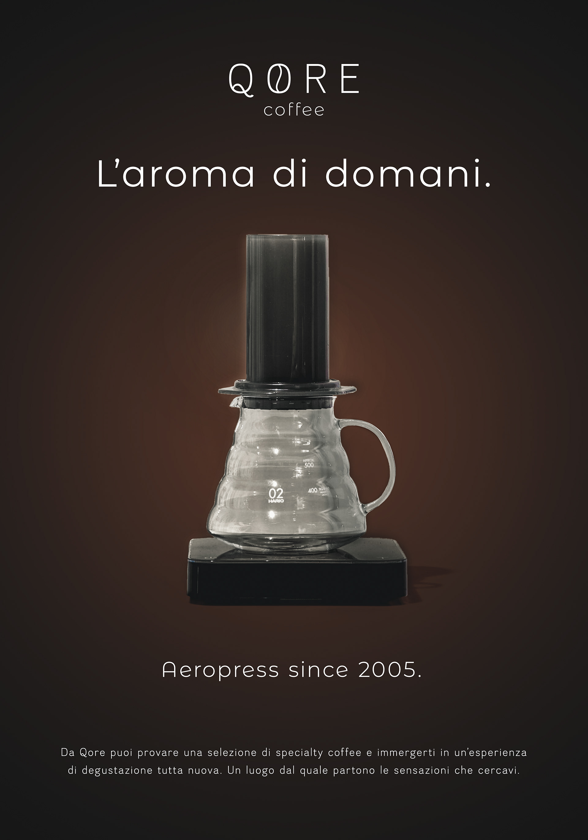
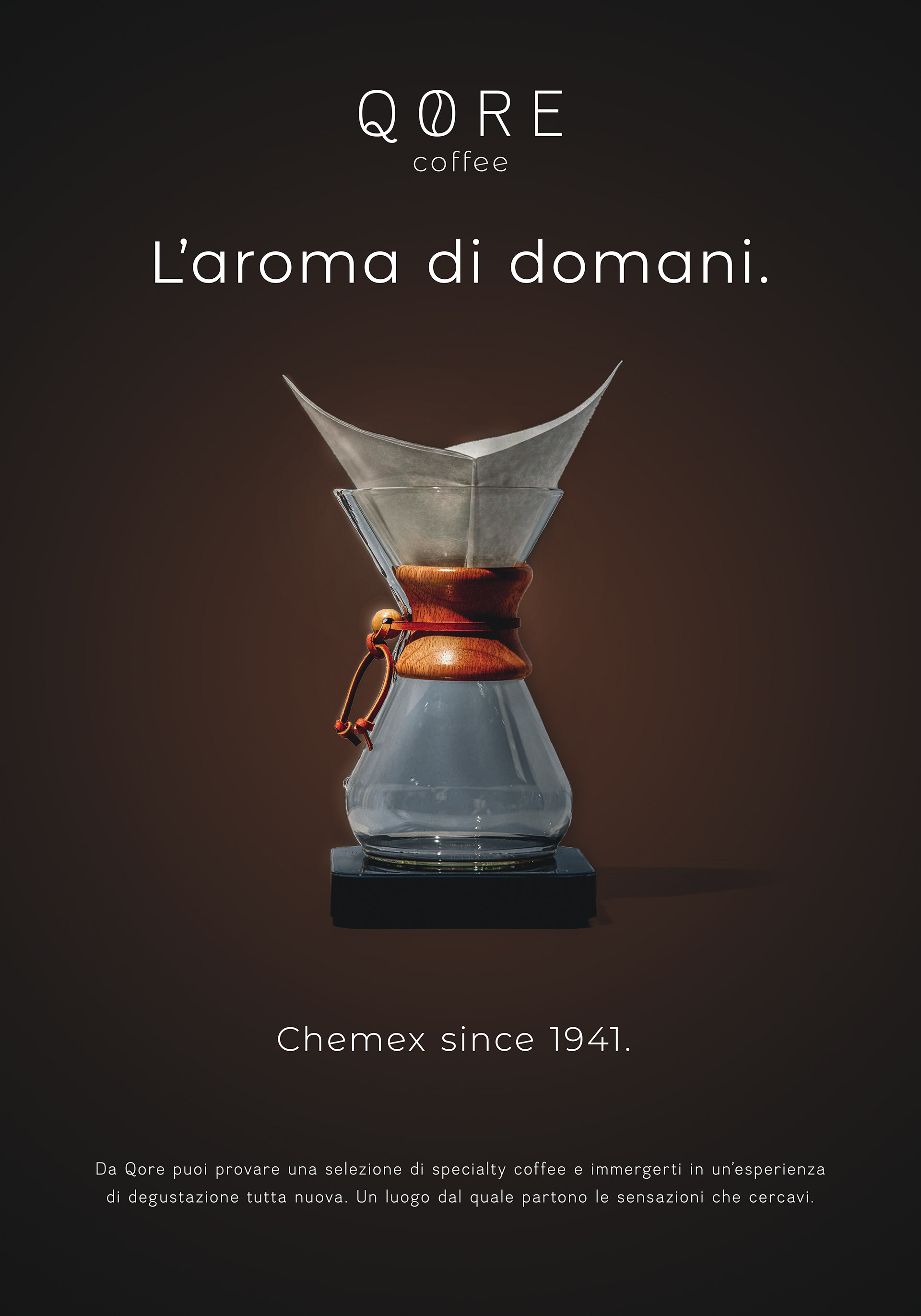
Creative Idea: We want to bring new "Brewing Methods" to people that they didn't know about. To highlight the tradition of Brewing Methods and the variety of coffee aroma.
Team: Gianluca Gradogna, Mattia Leoncini, Sebastian Zössmayr
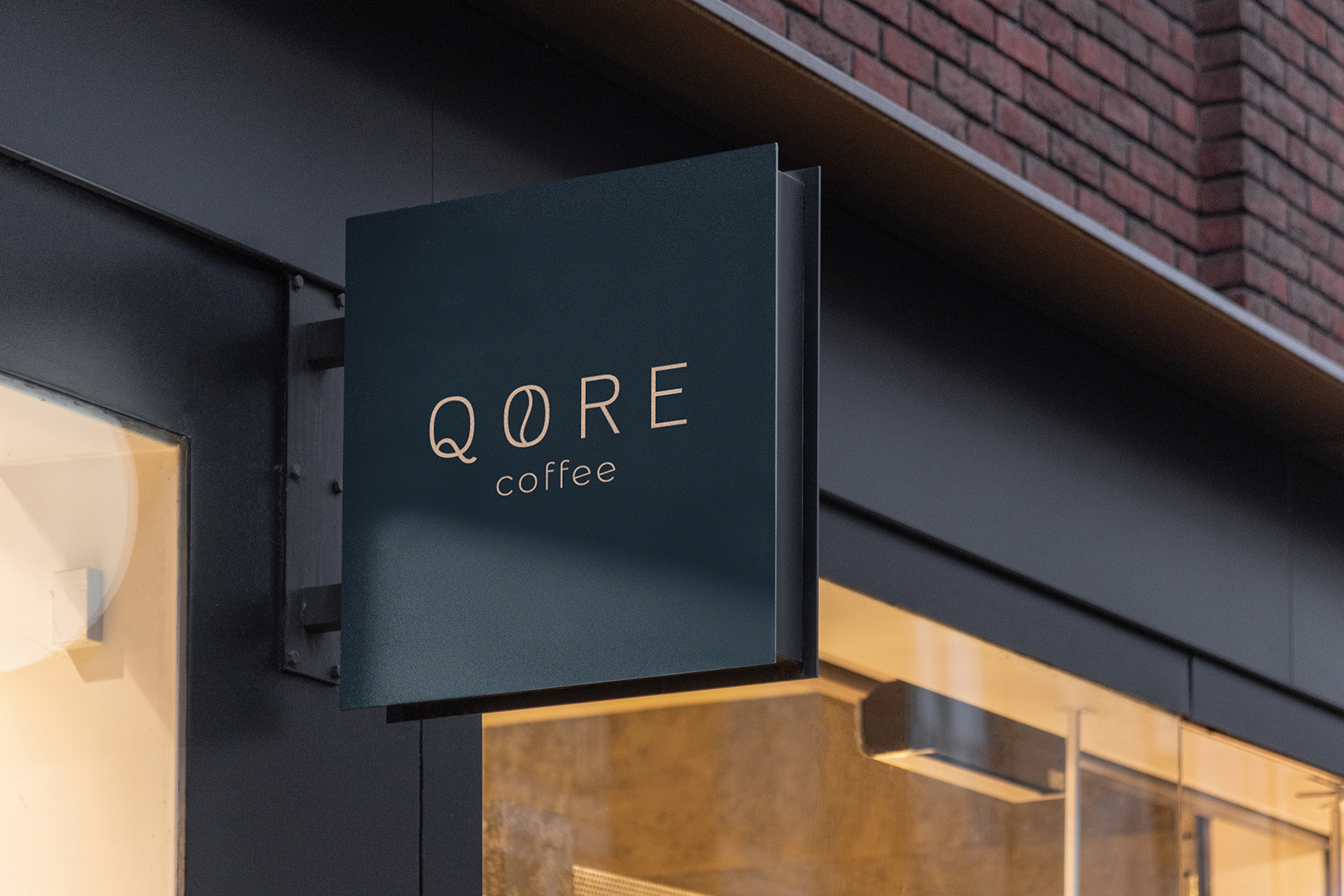
NAMING:
In the English term "Core" (nucleus, center) understood as the fulcrum of the new activity, and the term "Qahwa", the ancient Arabic term for "Café".
In the English term "Core" (nucleus, center) understood as the fulcrum of the new activity, and the term "Qahwa", the ancient Arabic term for "Café".
The aim is to represent with a union of the contemporary international language and an ancient term the concept of union between tradition and modernity.

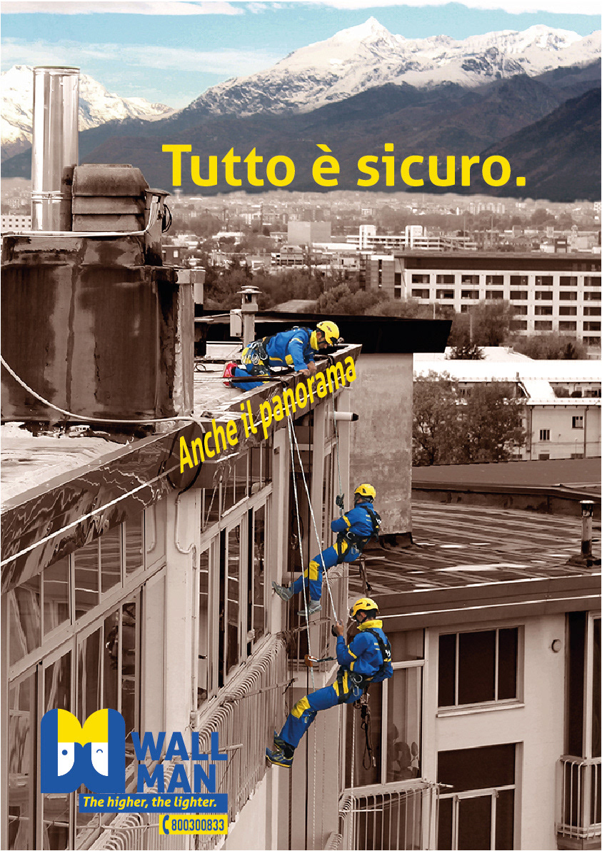
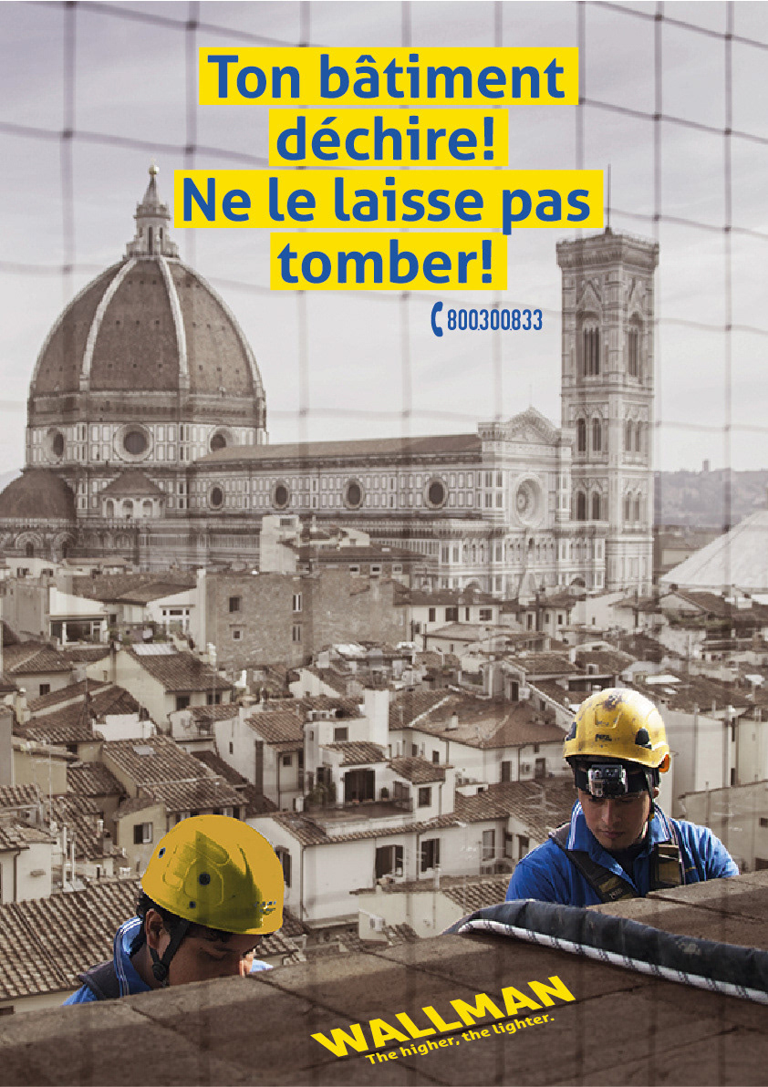
EDILIZIA ACROBATICA
Bief: Rebranding, International Campaign.
Concept: Not just workers; Acrobatic Construction has been innovation since 1994. For every problem there is always a solution. Offering the right solution is also giving an emotion.
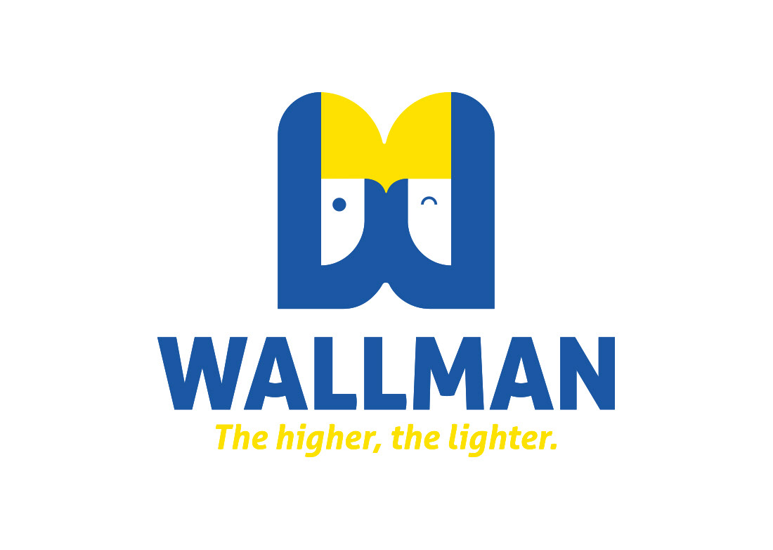
Creative Idea: For the logo we wanted to reflect this confidence, simplicity and sympathy of Edilizia Acrobatica in a 2D graphic. For the posters we played a lot with words to capture the passers-by with nice and funny phrases.
Claim: "The higher, the lighter"
Team: Vladislav Buffini, Luca Carniani, Arianna Fabbri, Sofia Mazzella, Beatrice Naldi and Cluadio Volpi
Wall + man: From the words "wall" and "man" translated into English.
The union of the terms creates a name that is easy to remember and can be traced back to the work environment in a simple and immediate way.
The pictogram depicts a worker on the left with a keen eye, and a worker on the right winking, and put together they create an "M", while the blue on the outside forms a "W", in that way we create the initials of WallMan.